Spotify

    Adding social features

    My Role: UX/UI Designer: UX Research, Information Architecture, Visual Design, Interaction Design, Usability Testing

    Client: Spotify, industry leader music streaming service

    Team: Self-directed (with expert mentor support and group crit feedbacks)

    Prototype: View prototype in Invison

    Time: 80 hours over 3 weeks, July, 2019

    About the project

    Background

    Spotify is the current industry leader in music streaming services with a mission to help people listen to whatever music they want, whenever they want, wherever they want—in a completely legal and accessible way. In order to maintain their leading position, Spotify wants to improve engagement and retention in the app by expanding upon their social capabilities.

    The Challenge

    • To design social features for Spotify’s mobile app
    • To follow Spotify’s existing design patterns
    • To smoothly integrate the new features into the current app for a seamless user experience

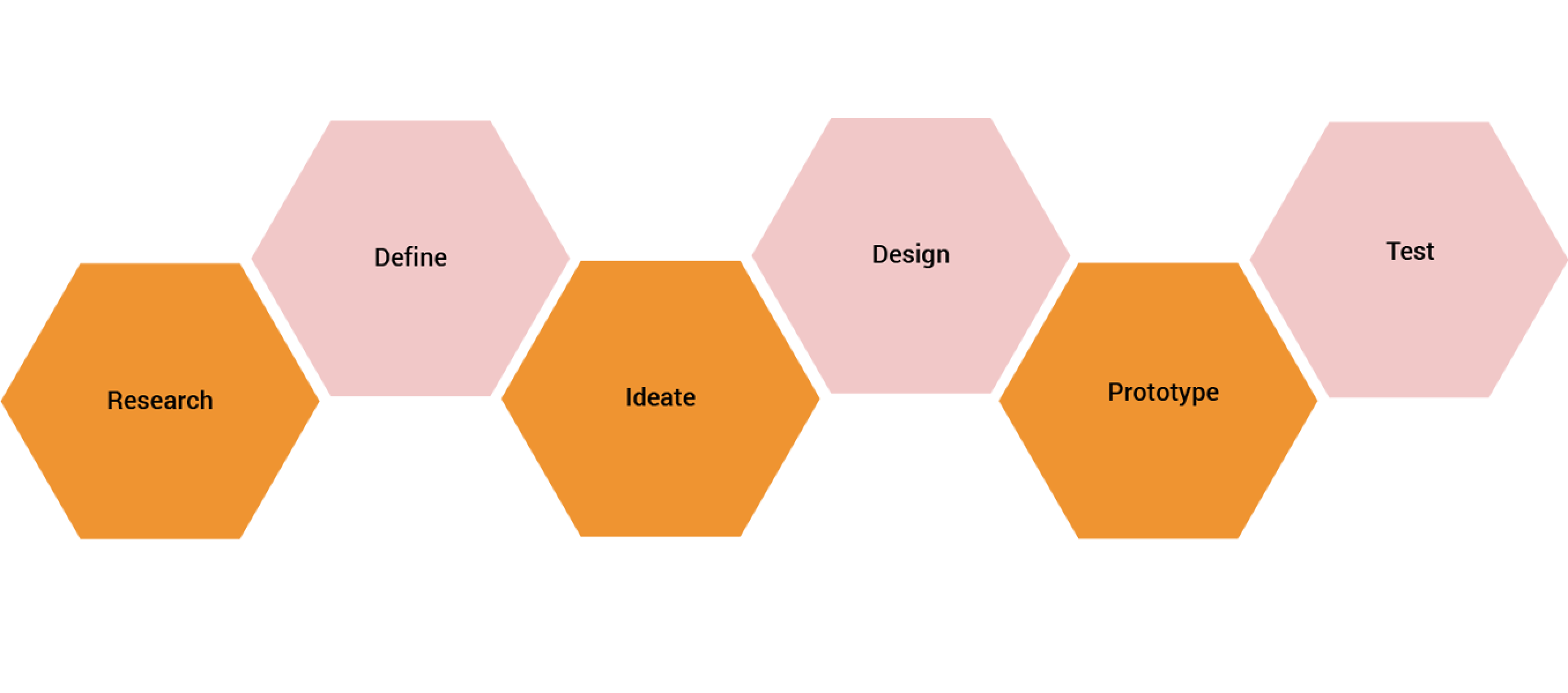
    Process

    01.Research

    Goal: To research the industry, Spotify and users

    Process: Market Research, Competitive Analysis, Heuristic Evaluation, User Interviews

    Market Research

    I started the entire research process by creating a research plan to outline my process and research goals as a starting point.View Research Plan.

    Once I outlined my research plan, I conducted a quick market research to gather information about Spotify, the music streaming industry itself and Spotify's position in the industry. I concluded that Spotify has a broad audience, however the age range of the target audience falls between 18-34 years. It's important to note that Spotify used to have an inbox feature but it removed the messaging capabilities in 2017 due to low engagement. These important insights made me focus on thinking about future social features that would generate high engagement by users and are user-specific as those features seem to be popular among Spotify users according to my research.

    MUSIC STREAMING INDUSTRY
    • Paid streaming subscriptions increased 32.9 percent in 2018 ( 255 million users )
    • In 2018, music streaming services reached more than 50 million subscriptions in the United States
    • In 2018 Fall, streaming was responsible for up to 75% of the U.S’s total music industry revenue
    • Rivals to Spotify are YouTube Music, Apple Music, Pandora, Amazon Music, Tidal, Deezer, Slacker Radio, Napster etc
    • On average, people enjoy music for 17.8 hours per week, with the car being the most popular listening location
    • Smartphones and tablets are go-to devices to access music by: 65% of all adults, 82% of millenials

    SPOTIFY IN THE INDUSTRY
    • 217 million monthly active users of Spotify (official Q1 2019 report)
    • Spotify is one of the most commonly used apps for listening to podcasts in the U.S.
    • Spotify accounts for 30% of total revenue generated by the recorded music industry, and 42% of the streaming market
    • In the US, Spotify has among the greatest reach of any app on mobile, with around one-in-five mobile users reporting using it.
    • One of Spotify’s most-loved features is the user-specific playlists generated daily for each listener, based on their listening history

    DEMOGRAPHICS:
    • 56 % male, 44% female
    • 29% are between 25-34 years old
    • 26% are between 18-24 years old
    • 19 % are 55+ years old
    • 16% are between 35-44 years old
    • 11% are between 45-54 years old
    • Average income of self-paying subscribers are at $88,000
    • Millennials are far more likely than their elders to pay for music streaming

    SPOTIFY INTEGRATIONS + COLLABORATIONS
    • Facebook Messenger: Lets friends discover and share music directly in their chats
    • Discord: Users can also see and play what their friends are listening to.
    • Tinder & Bumble: Lets potential matches know what music the user is into
    • Instagram Stories: fans and artists are able able to share Spotify albums, tracks, artists, and playlists directly to Instagram Stories
    • Other non-social: Google Maps, Samsung, Starbucks, Uber, Waze, Last.fm, Starz, Runkeeper, Nike + Run Club, Stubhub, Shazam

    Competitive Analysis

    Spotify is the leader in the music streaming industry so I decided to analyze how Spotify might distinguish itself from its competitiors. Through my analysis, I was pointing out the strengths and weaknesses of the competitor music streaming services, which were Apple Music, Pandora, Soundcloud and Amazon Music. I compared them to Spotify based on some certain additional factors: monthly unique users in the US, subscription price, music library size, platforms, strengths and weaknesses.

    Heuristic Evaluation

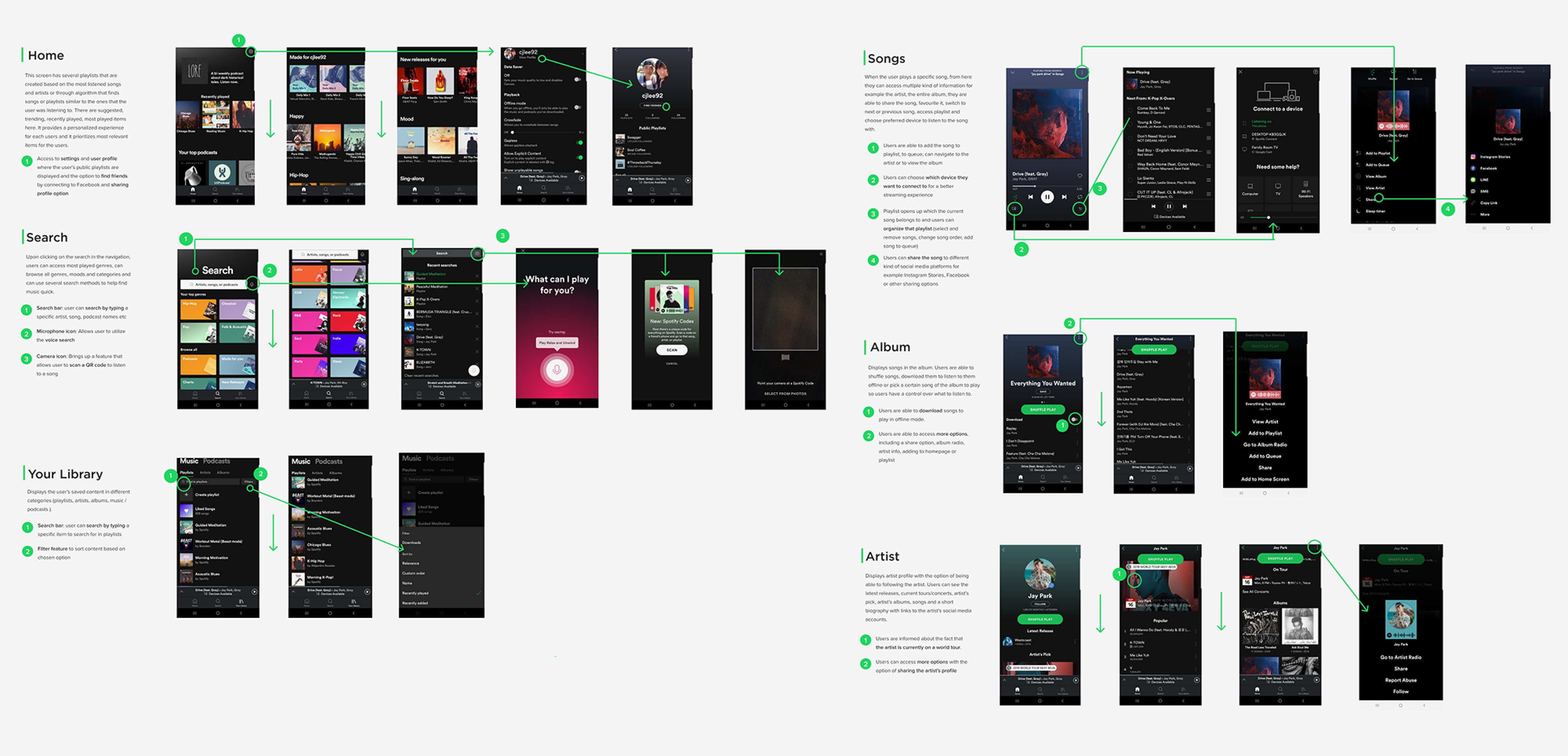
    Then I conducted a heuristic evaluation to learn about the current app's information architecture, hierarchy, content, features to be able to consider how I could integrate a new feature within the existing design. I analyzed the latest version of the mobile app's premium version by taking screenshots of main screens and explaining the purpose of each screens with annotations to important features. I was able to identify the design patterns of Spotify that allowed me to integrate the new features seamlessly.
    User Interviews

    To empathize with Spotify's users, I conducted 5 interviews in person as my primary research method. I asked open-ended questions from the participants about their experiences with Spotify, their general music listening and sharing habits as well. 3 males and 1 female were interviewed whose age fell between 22 and 31.

    View Interview Findings

    Interview Participants

    • Number of interviewees: 5
    • Gender breakdown: 3 females, 2 males
    • Age: 22-31
    • Criteria: Spotify Premium member
    • Location: Scottsdale
    • Interview lenght: 10-15 minutes / person

    02.Define

    Goal: Synthesize research to define the target audience - and their needs, frustrations, goals

    Process: Empathy Map, Persona, POV Statements & HMW Questions

    Empathy Map

    Then I started to take all the information I gathered about the users and organized them to look for meaning and patterns to find out the user needs by creating an empathy map. Each sticky note color belongs to different interview participants and key observations are written on them, which are organized into different categories (doing, thinking feeling, hearing, seeing, pains, gains). Then I was looking for common answers and patterns across the sticky notes. The similar ones were grouped further which is how I got my insights and based on these insights I identified the user needs of Spotify.

    Insights:

    • Users want to share their experience of a song with others.
    • Users search for playlists based on their moods.
    • Users love discovering music through their social circle.

    Needs:

    • Users need a way to express their thoughts about songs they share.
    • Users need a way to find playlists efficiently that matches their current feelings.
    • Users need to know what their social circle is listening to.

    User Persona

    By taking the findings from the empathy map I could start building the user persona who I named Jeremy Song who he reflects the ideal customer of Spotify. I chose the persona to be a Male as my secondary research findings indicated that more males use Spotify than females. Jeremy represents the key target audience - the Millennials - and by keeping his goals and needs in mind throughout the entire design process helped me design user-focused features.

    POV Statements & HMW Questions

    With the target audience defined, using the needs and insights, I crafted "Point of View" (POV) statements to define the core problems of users. Based on the POV statements, I could create the How Might We questions that helped me to start generating innovative ideas in the right direction to make the user experience more enjoyable and social for Jeremy.

    03.Ideate

    Goal: To generate ideas about the information architecture, new features and user flows

    Process: Individual Brainstorming, Group Brainstorming, Business & User Goals, Product Roadmap, Sitemap, Task Flow, User Flow

    Individual +Group Brainstorming

    Based on the How Might We questions, I started to brainstorm ideas individually about how I could solve the problems of Jeremy. I spent a few minutes per HMW questions and took a list of all the ideas that came across my mind and I created a document where I collected my ideas to. View my list of ideas

    Then I held a group brainstorming as well to generate even more ideas and possible solutions to the problems of Jeremy. I started the session by explaining the project brief shortly and then introduced ‘Jeremy Song’, our persona to the participants to let them know who I am designing for. I held two rounds of brainstorming ideas, each consisted of 5 minutes brainstorming / HMW questions that I presented to the participants after another. View the group's list of ideas

    Strategy: Business & User Goals + Product Roadmap

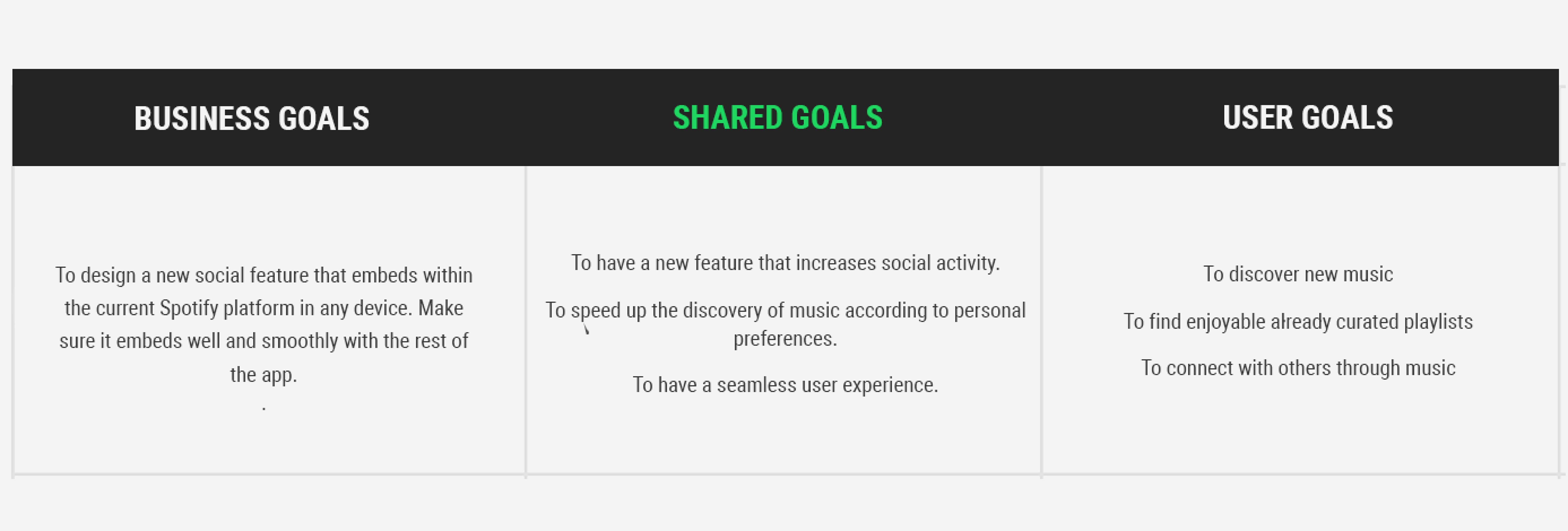
    Next, I focused on defining the shared goals of Spotify and the users to help achieve both the business stated goals and user goals.I identified the shared goals of Spotify and the users in order to make better design decisions.

    Then I laid out a Product Roadmap document, where I prioritized the how might we questions and identified new features that could solve the problems of Jeremy. These new feature ideas are coming from the individual and group brainstorming sessions and I chose the ones that could be best implemented into the app and best solves the problems of the user.

    View Product Roadmap.

    Information Architecture: Sitemap

    Moving forward, I built the sitemap of the app to show where the new features will be integrated into the existing app.

    At first I was planning to add the Friends Feed feature to the navigation bar as it serves as the main new feature that increases social activity. However since Spotify has recently simplified the bottom bar by removing multiple navigation items, I decided to integrate the Friends Feed into the search screen. This feature allows users to discover new music through friends' activity history or posts.

    As for the Check In Mood feature, the potential best placement for it would be on the Search screen as well as this feature functions more like a new search method. By utilizing the Mood search feature, users can search for curated playlists based on their moods which satisfies both a user goal and need.

    User Flow

    I created a User Flow diagram to visualize how Jeremy would navigate through the app using the new features.

    The first scenario focuses on the Mood feature that satisfies Jeremy's need of finding playlists efficiently that match his current mood and meets his goal of listening to enjoyable, already curated playlists. The second scenario allows Jeremy to discover new songs through friends and connect with others through music which are important goals of his. By using the new Friend Feed feature, he's also able to meet some of his needs:expressing his thoughts about music he shares and knowing what his social circle is listening to. .

    Task Flow

    Then I created a few Task flows to map out the user journey for multiple single key tasks which are going to be completed a very similar way by the majority of users. These additional singular task flows helped me better understand what steps users take in order to achieve their goals so I identified additional UI elements that I needed to design alongside the new features for the perfect flows.

    04.Design

    Goal: To design high-fidelity wireframes and integrate the UI of new features into the existing Spotify app

    Process: Low-fidelity Sketches, High-fidelity Wireframes

    Low-fidelity Sketches

    After I have identified the key screens that were needed to be designed in order to help Jeremy achieve his goals and tasks successfully by using the new features that I was planning to integrate into the app, I sketched out the layout and placement of the new features before going digital. These are the low-cost low-fidelity wireframe sketches with annotations to explain certain elements.

    High-fidelity wireframes

    By relying on the low-fidelity sketches, I designed the high-fidelity wireframes in Figma. I recreated the existing UI of Spotify as pixel-perfect as I was able to and I implemented the new features into the screens while making sure that I'm using already existing design patterns within the app and I tried not to introduce new patterns - only if it was necessary. These high-fidelity wireframes demonstrate the look and feel of the app with the new features integrated into the UI. I also created new playlist covers - based on existing album designs - for the homescreen's From Your Community's & For Your Frequent mood's playlists as they are additional parts of the new main features.

    05.Prototype

    Goal: To build an interactive prototype that can be tested by users

    Process: High-fidelity Prototype in InVision

    Mobile App Prototype

    Now that I had my new features integrated into the app's existing UI, I was ready to test the new features with users and gain valuable feedback from them in order to figure out what is needed to be improved on the current design. I linked my high-fidelity wireframes together by using hotspots in InVision and the limited functionality prototype was ready to be tested with a few users.

    06.Usability Testing + Iteration

    Goal: To test how well the new features solve problems + improve usability based on results

    Process: Usability Test on High-fidelity prototype, Affinity Map, Revisions, UI Kit

    Usability Test

    I started the Usability Test by creating a Test Plan document to guide me during the usabiliity test and to know how to go about the process and then I conducted in person usability testing with 5 participants (3 females and 2 males), whose age fell between 22 and 35.

    Test Objectives

    • Determine if participants can complete the given tasks by interacting with the new features
    • Identify any pain points and confusion of participants
    • Identify possible changes that might improve user performance

    User Tasks

    • Search for a playlist that match your current relaxed, calm, peaceful mood
    • Try to search for a list of songs that your social circle is listening to.
    • Listen to a song that you think you kind of like from the list
    • Find a friends playlist that is suggested for you by Spotify
    • You want to read about the latest song related posts that your friends shared with the community

    Results

    After reviewing the videos that I recorded of the participants while completing the given tasks, I put together a document of how the participants completed each tasks, what I observed and what they said or recommended regarding the prototype.
    View Test Findings

    Affinity Map

    With the help of the test finding notes that I transcribed from the recordings, I could create the affinity map to synthesize the findings to find out what could be improved on the prototype. I took notes from the test findings and grouped together the ones that were similar, tried to find patterns across the observations and comments, which is how I got my insights. Based on these insights recommendations were made to improve usability, which were prioratized from high to low.

    Insights:

    • Users don't seem to clearly understand what the new features can offer upon coming across them before interacting with them.
    • Users seem to be unsure about which songs they would like to check out when looking at the Friends Activity feed

    Recommendations:

    • In-app notification to update users about the new features added with a short explanation of what they can be used for.
    • As friend activity screen will contain a long list of recently listened to songs by users, a Sort by Relevancy filter that works off the Spotify algorithm would make their decision making process easier.

    Iteration

    After I synthesized the results of the usability testing and I identified what could be improved on the design, based on the recommendations from the affinity map, I made changes on the wireframes and prototype to improve user experience. I added the in-app notification section to the homescreen per new features, which can be closed by users upon reding them and tapping on the 'x' on the bar. The sort by relevancy update was applied to the Friends Activity screen, which helps user sort the listed songs showcase based on their music taste.

    UI Kit

    I put together a UI Kit to share UI elements with other designers or develpers on the team later on. I designed all of the elements from scratch all over again and the new features' elements were designed based on existing patterns that I noticed within the current app.

    Reflection

    This project was quite challenging for me and in the beginning I found it difficult to integrate new features by not introducing any new design patterns. I had quite a different vision of the look and feel of the new features until I got to the step of designing the high-fidelity wireframes where I realized that it was a must to follow Spotify's existing patterns in order to successully blend the new features into the UI. However I could overcome this major challenge by analyzing the current app in depth so I could use some of its UI elements as references that I could apply to the new features.

    Next Steps

    • Build out the Friends News Feed feature entirely.
    • More rounds of usability testings to keep making improvements.
    • Track the engagement of the new features.

Copyright © 2016-2022 szanilee.com.
Website Design & Development by Szani Lee.