Inventory Ordering Business App

    Mobile app design in Microsoft Power Apps

    My Role: UX/UI Designer / Product Designer (solor designer)

    About: Rapid design of a business application that was developed using Microsoft Power Apps

    Team: Myself as the UX/UI Designer/ PRoduct Designer, a Technical Engagement Specialist, an Enterprise Data Manager

    Prototype: View prototype on MarvelApp

    Time: 1 week, May 2020
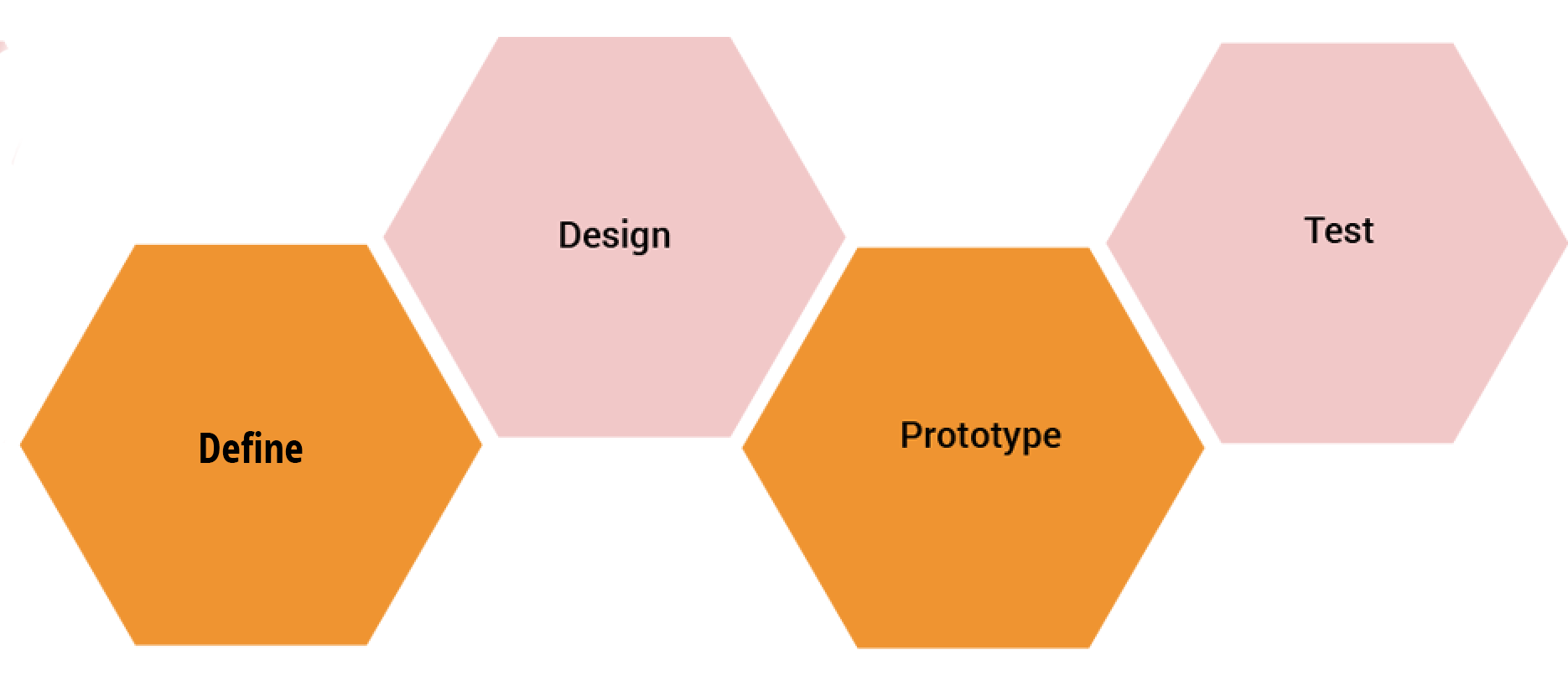
    About the project

    Background

    This Inventory Ordering Business App was created to reimagine the entire ordering process within the company, which is now quicker and more efficient for the employees of Service Management System's two managed brands. By creating this app, we were able to speed up the workflow of the AP & Purchasing Supervisor as well, who eventually handles the incoming order requests on the backside of the app and sends the requests to vendors upon the approval of managers & supervisors. The app makes it easy for the user to track the progress of all of their orders by being updated whenever the status of the orders has changed. The data is connected to the company's CRM platform (Dynamics 365).

    The Challenge

    • To replace the time-consuming and complicated paper ordering form with a digital app
    • To design the application rapidly
    • To make the app user-friendly & simple for a NON-tech savvy audience
    • To use design patterns that is easy to build in Microsoft Power Apps due to its technical limitations

    Process

    01.Define & Ideate

    Goal: To identify the problems and come up with solutions rapidly

    Process: Processing the stakeholder meeting notes, Brainstorming solutions

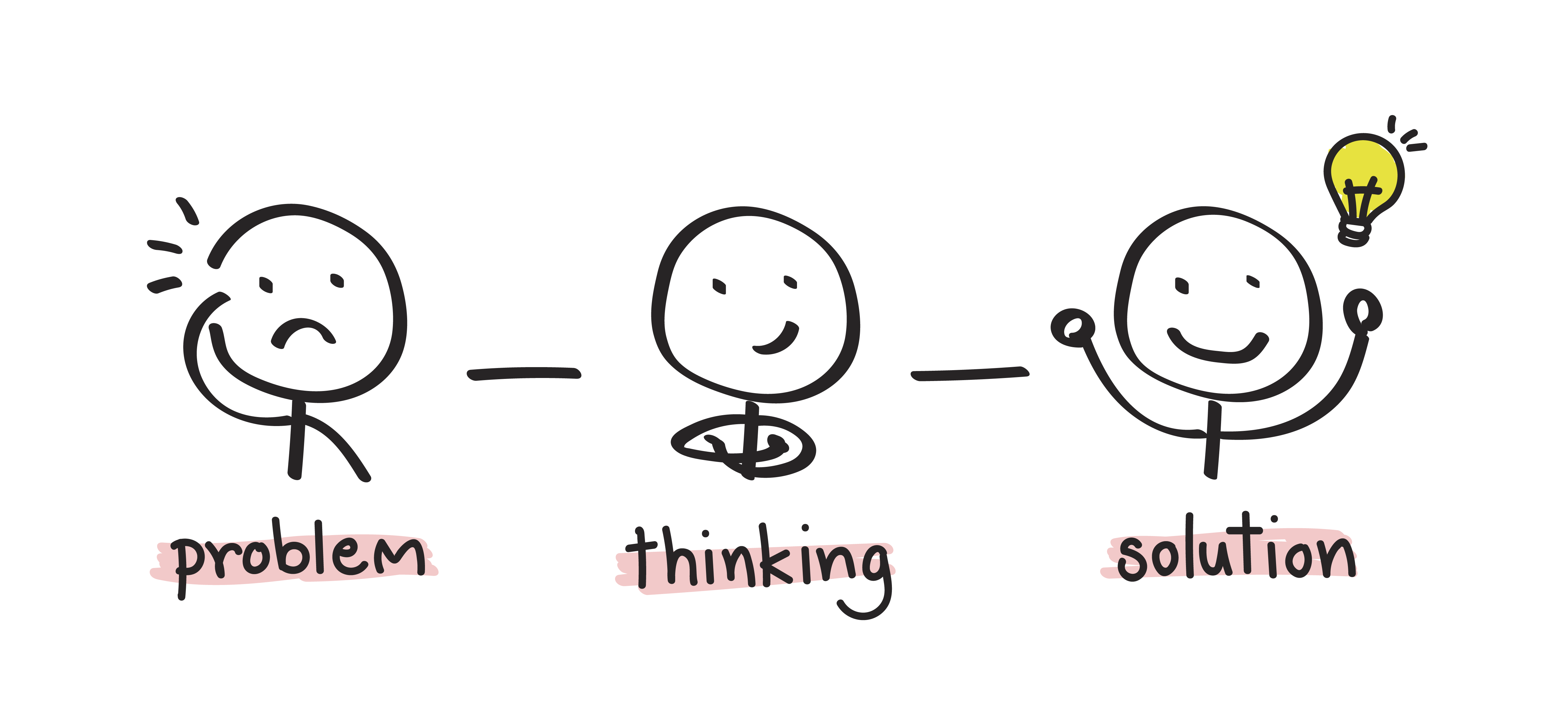
    Since the business app needed to be designed and shipped urgently, I had to challenge myself to design an app without implementing my go-to primary research method, which is in-depth user interviews. Instead, I was required to create the app based on a couple of stakeholder meetings and brief discussions with future users. When all the problems were identified and concluded based on the notes taken, potential solutions were brainstormed and are listed below:.

    THE PROBLEMS

    • Paper forms of the Inventory Ordering documents are time-consuming to fill out
    • Complicated inventory ordering process: Employees send in their list of needed items through a paper document that they have to print out, fill out, take a photo of and attach the photos in email then finally send it to the AP & Purchasing Supervisor
    • Lengthy lists with hundreds of different kind of items seem to be time-consuming to select from when ordering on paper: Employees need to checkmark the items they need to order but since it is on paper, they have to look for each item manually
    • AP & Purchasing Supervisor is overwhelmed with a massive amount of incoming emails sent by several employees on a daily level who wish to order certain items for the selected clients who SS offers food processing plant sanitation services.
    • Inventory Ordering documents are unorganized in the Mailboxes
    • Unable to keep track of previous or current orders easily and efficiently

    THE SOLUTIONS

    • Replacing the Inventory Ordering form document with a digital mobile application offering a simplified ordering flow
    • E-commerce style app: Ability to look up the available categorized product catalogs of each clients (food processing plants) and the items can be quickly browsed, searched for and added to cart for order.
    • Connect the app’s data and the incoming order requests to the company’s CRM platform (Dynamics 365) through where the AP & Purchasing Supervisor is able to handle the orders instead of receiving them in his Outlook inbox
    • Ability to track all the orders created by each user
    • Status feature: Lets the user follow the progress of the created order request that needs to be viewed and approved by Managers or Supervisors before get sent to the purchasing department

    02.Design

    Goal: To design the app rapidly and get ready for usability testing

    Process: Low-fidelity Sketches, High-fidelity Wireframes

    Low-fidelity Sketches

    What did I do?

    • I rapidly sketched out the main screens of the app while keeping in mind the existing problems and suggested solutions.
    • I was also referring to the Inventory Ordering paper document that all the employees were using at that point when they wanted to submit a new order to the purchasing department.
    • I scheduled a meeting with my team to propose my e-commerce style app idea and direction to discuss and receive valuable feedback on it.
    • After some initial discussions I got the green light to move forward with the idea so I was ready to dive myself into the high-fidelity wireframes as we had a very limited time to ship the product.

    High-fidelity wireframes

    Based on the low-fidelity sketches, I started to design the high-fidelity wireframes and prepare a prototype to use during the upcoming usability tests. I have estabilished the branding of the company prior to this project so had to make sure to design the user interface according to the branding guidelines. While I was working on the wireframes, I had to keep in mind that Microsoft Power Apps has technical limitations so I needed to keep the design as simple as possible. I was required by the developer to place all visual elements and the content to a fixed screen size wherever it was possible to do so. I also had to keep in mind that the product will be used by employees who have little to no experience with modern applications so the interface had to be designed using common UI design patterns to increase the ease of use of the product. It was definitely challenging but I have overcome the barriers rapidly.

    03.Usability Testing + Iteration

    Goal: To test how easily the users can complete the main tasks within the app and to improve usability based on results

    Process: Usability Test on High-fidelity prototype, Affinity Map, Revisions

    Usability Test

    Before scheduling the moderated remote usability testingon a high-fidelity prototype built in MarvelApp, I put together a Test Plan document to guide me during the usability test where I identified which main tasks I was going to ask them complete on the spot. The actual usability testing sessions took place via Microsoft Teams screensharing due to the pandemic that I was able to record with the permission of the participants so later I could rewatch them.

    Test Objectives

    • To determine whether the application is easy to use for participants
    • To identify frustrations of participants during interaction with the app
    • To identify possible changes that might improve user performance

    User Tasks

    • You need the items by May 5 the absolute latest. Start a new order through the app.
    • Please add two different kind of items of your choice to your cart! You need 3 pieces of one of the items.
    • You realized that you might only need 2 of the *selected item* so please update your cart accordingly.
    • Before you submit your order, share an important message with the receiver, which is that this order is urgent and if it was possible to get it by May 1, you’d be really grateful.
    • Please create another order, add only 1 item of your choice in the cart. Submit it!
    • Please go find that specified order and cancel it.
    • You want to take a look at your previous orders and only look at the Canceled status ones.

    Results

    After reviewing the videos that I recorded of the participants while completing the given tasks, I put together a document of how the participants completed each tasks, what I observed and what they said or recommended regarding the prototype.
    View Test Notes

    Affinity Map

    After I had rewatched the recorded videos, I created an affinity map to find out what could be improved on the design. I took notes from the test findings and grouped together the ones that were similar then tried to find patterns across the observations and comments, which is how I got my insights. Based on these insights I made some recommendations how we could improve the user experience for the users.

    Insights:

    • Users had difficulties starting a new order because they didn’t notice the ‘+’ CTA button
    • Users missed clicking on the ‘OK’ on the calendar picker due to its poor visibility & small text
    • Users tend to overlook the Note sections (Note to order & Reason of cancellation)
    • Users showed some type of confusion about the different Order Statuses

    Recommendations:

    • Redesign the New Order CTA button and go with a more standard button shape
    • I would suggest to increase the text size of the ‘OK’ & ‘Cancel’ of the Calendar but Power Apps built-in Calendar element is used by the developer on the team so there is nothing that can be done at this point
    • Draw attention to the Note sections with an icon or a popping color of text
    • Cheetsheet that is explaining briefly what each status means

    Iteration

    I met with them team to discuss the changes made and after some discussion we agreed to move forward with them with the exception of the Calendar update due to some technical limitations.

    Final Prototype

    Feel free to interact with the limited-functionality high-fidelity prototype that I built in MarvelApp! Since the app was shipped for internal purposes at the company, only the prototype can be viewed.

    Reflection

    This project seemed to be challenging because it required lots of rapid thinking - such as identifying the problems and coming up with solutions in such a short amount of time as the app had to be designed urgently. Another challenge I faced was that I needed to design the app and ensure a seamless user flow for non-tech savvy users by relying on a paper document and a couple of stakeholder discussions. However I knew that if I merge my ideas and proposed solutions to the problems, I can design an app that satisfies both the user and business goals. The users reported to be very happy with the product that saves them so much time when they submit new order requests and the Purchasing Supervisor is able to focus on other tasks since we made his workflow so much quicker than it previously was.

    Next Steps

    • Continuous usability testings and conversations with users
    • Identifying further improvements on the app

Copyright © 2016-2022 szanilee.com.
Website Design & Development by Szani Lee.