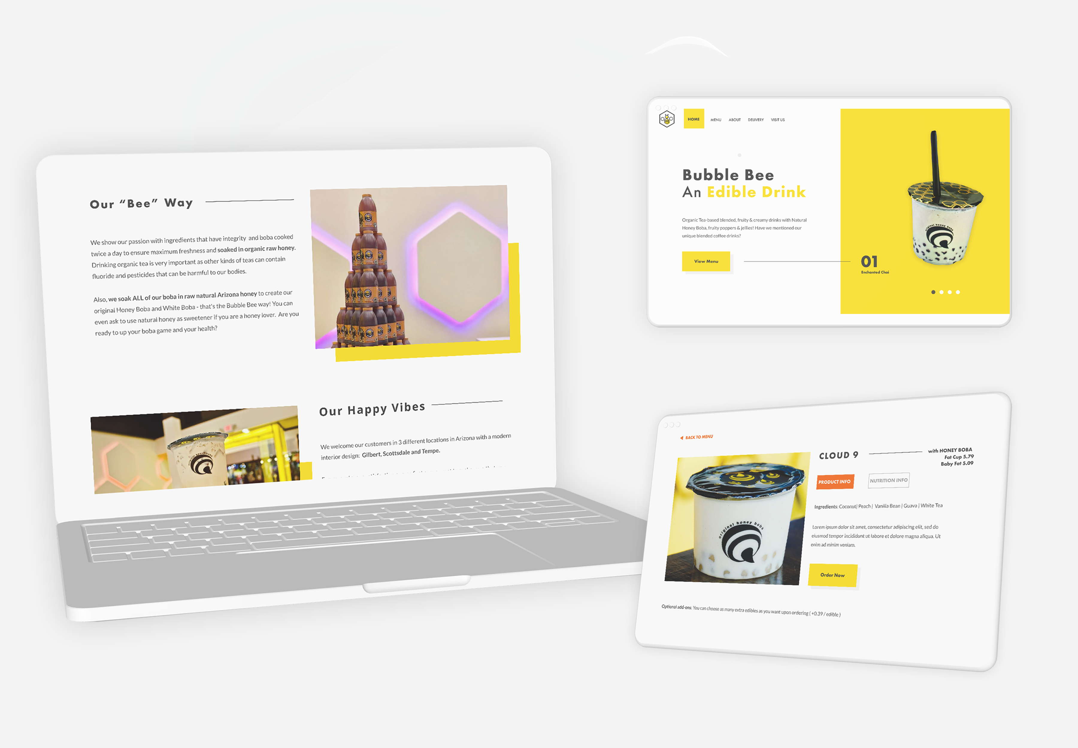
Bubble Bee
Responsive Web Design for a local business
My Role: UX/UI Designer: UX Research, Information Architecture, Visual Design, Interaction Design, Usability Testing
Client: Bubble Bee, local bubble tea store
Team: Self-directed (with expert mentor support and group crit feedbacks)
Prototype: View prototype in Invison
Time: 80 hours over 4 weeks, June-July, 2019
About the project
Process
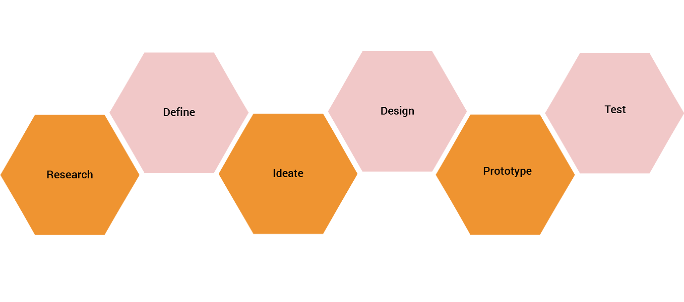

01.Research
Goal: To research the current position of the business and its customers
Process: Market Research, Competitive Analysis, User Interviews
Competitive Analysis
I looked into who the competitors of Bubble Bee are to understand the industry standards by pointing out the strenghts and weaknesses of direct and indirect competitors. I developed an understanding of how other bubble tea websites design for their users and how they solve problems for similar user needs. I chose the direct competitors by searching for other popular local shops in the area that sell bubble tea and/or have similar concept to Bubble Bee. As for indirect competitors, I chose businesses that sell similar yet different products, but satisfying the same user needs.

02.Define
Goal: Synthesize research to define the target audience - and their needs, frustrations, goals
Process: Empathy Map, Persona, POV Statements & HMW Questions
Empathy Map
Next, I started to organize all the observations and information that I gathered during the 1:1 interviews and created an empathy map. I wrote key findings on sticky notes from each participants and organized them into categories (doing, thinking/feelings, hearing, seeing, pains, gains) then was searching for patterns across the notes and grouped those further based on recurring patterns I identified across the answers. Based on the insights, I could identify the user needs of the customers of Bubble Bee.

User Persona
I created a persona - called "Amy" - based on the empathy map, who represents the key audience of Bubble Bee. I took needs directly from the empathy map findings and the information placed in each sections are based on the interview conversations and the empathy map. I was able to establish the ideal type of users whom I will primarily be designing for.

POV Statements & HMW Questions
I defined the core problems of users by creating POV Statements to start the ideation process in the right direction. I took the insights and needs from the research findings, to be more precise, from the empathy map after having synthesized my findings and created the POV statements with the combination of our persona (Amy), insights and needs. Based on the POV statements, I could phrase the HMW questions that helped me to start my brainstorming process about how I could solve the problems of Amy that I defined.