BeautyShelf
Sorting Your Products, One Shelf at a Time!
Featured in "The Best Fashion and Beauty App Designs" by DesignRushMy Role: UX/UI/Product Designer
Team: Self-directed
Prototype: View prototype in Invison
Time: 4 weeks, August - September
Type: End-to-end mobile app design
About the project
Process

01.Research
Goal: To research the beauty industry and identify the demographics of BeautyShelf
Process: Market Research, Competitive Analysis, Provisional Personas, User Interviews
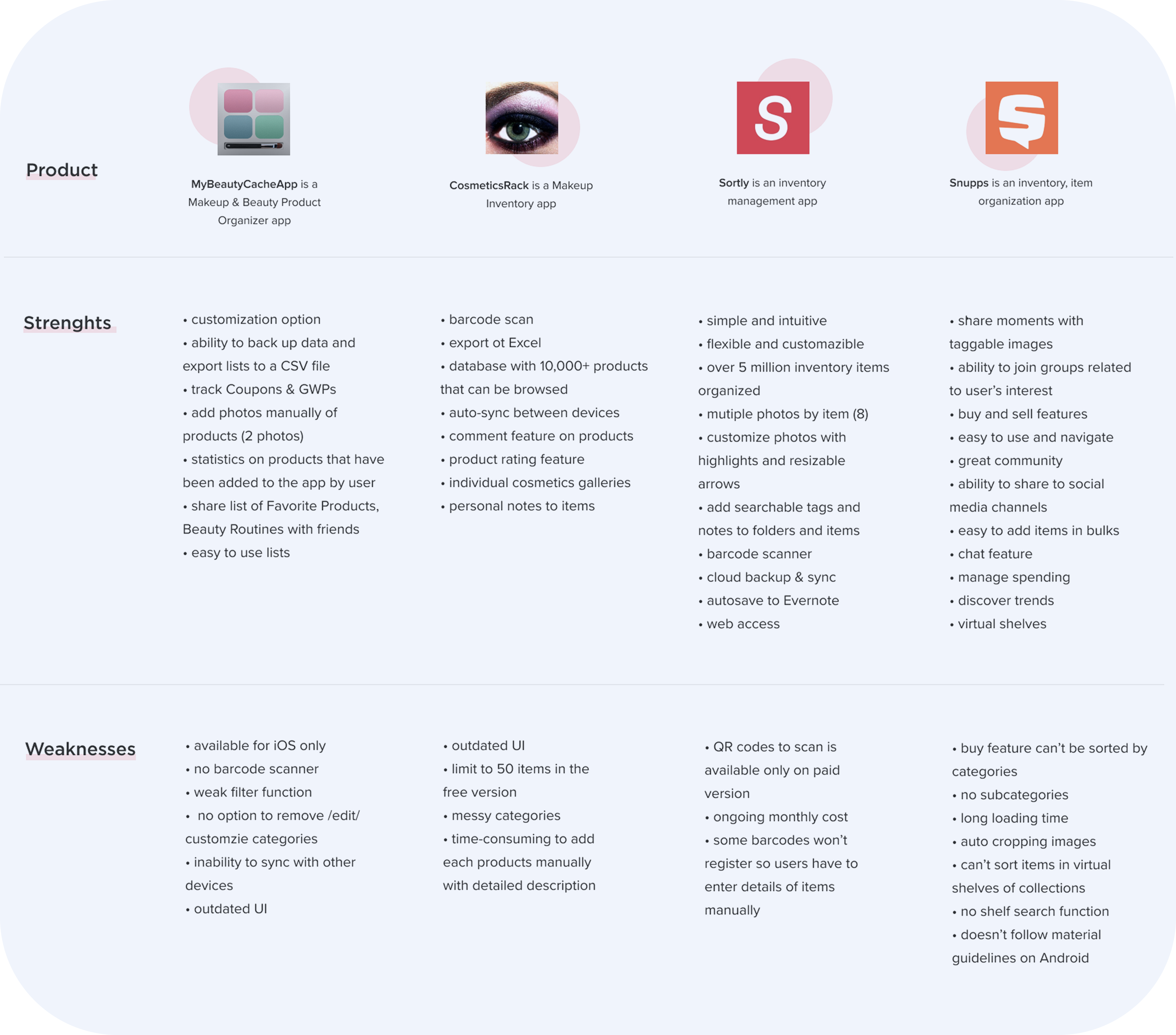
Competitive Analysis
When I checked out the competition, I found there weren't many beauty inventory products available, and the ones that existed had slightly different approaches. After analyzing their strengths and weaknesses, I saw an opportunity for BeautyShelf to excel by offering well-organized product lists, a modern user interface, and a personalized experience. This personalized touch could set BeautyShelf apart from other apps.
Provisional Personas
Based on the secondary research that I have completed, I created 3 provisional personas to define who the potential users are of BeautyShelf. These personas represent different groups of people with goals and frustrations. These personas gave me a starting point to focus on who I should approach and interview when I moved towards my primary research method, which was the in person interviews.

02.Define
Goal: Synthesize research to define the target audience - and their needs, frustrations, goals
Process: Empathy Map, Persona, POV Statements & HMW Questions
Empathy Map
To streamline the synthesis of the extensive data gathered from the 5 interviews, I utilized one of my favorite tools, an empathy map. This helped me visualize the behaviors and attitudes of potential users more easily. By identifying patterns across the sticky notes representing data from each interviewee, I grouped similar ones into smaller sections. These three main groups provided valuable insights that guided the entire product design process. They became my go-to reference points whenever crucial feature or design decisions needed to be made.

User Persona
Say Hi to Cholette! By combining the secondary and primary research findings, I created our persona whom I named Cholette. She is our fictional ideal user of BeautyShelf so her needs, goals, frustrations and motivations were kept in mind while making important design decisions. By relying on Cholette, I was able to design the app and features that best serve user needs.

POV Statements & HMW Questions
Once I knew WHO I am designing for, what the specific needs are of my target audience, I needed to define the core problems of my users in order to create a user-centered product. With the target audience defined, using the needs and insights, I wrote "Point of View" (POV) statements to define the core problems of users. Based on the POV statements, I could create the How Might We questions that helped me to start generating innovative ideas in the right direction to make the user experience delightful for Cholette.